


Sobre
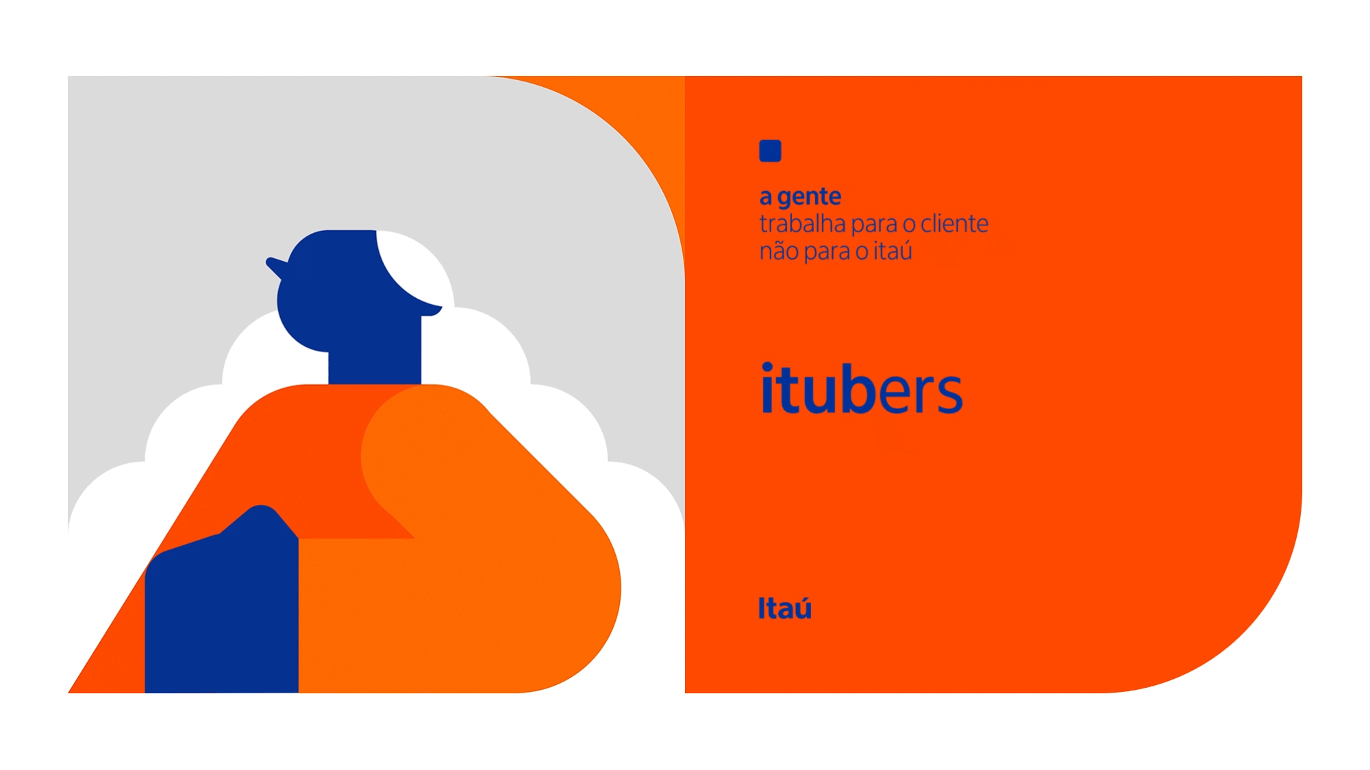
Itubers é como se nomeiam os 87 mil colaboradores do Banco Itaú. O projeto da Tég © Bureau de Inteligência Criativa, em colaboração com a agência Galeria, apresenta uma nova identidade visual integrada que expressa a construção da cultura interna do banco. O projeto – modular, lúdico e flexível – contextualiza os novos valores na rotina do colaborador de forma atraente e cativante, enquanto estimula seu reconhecimento e pertencimento.
A proposta rearticula o sistema gráfico da empresa – um dos mais reconhecidos do Brasil – e integra de forma coesa e flexível sua tipografia, ícones, cores, grafismos, imagens e ilustrações em composições dinâmicas alinhadas sob a mesma gestalt da marca.
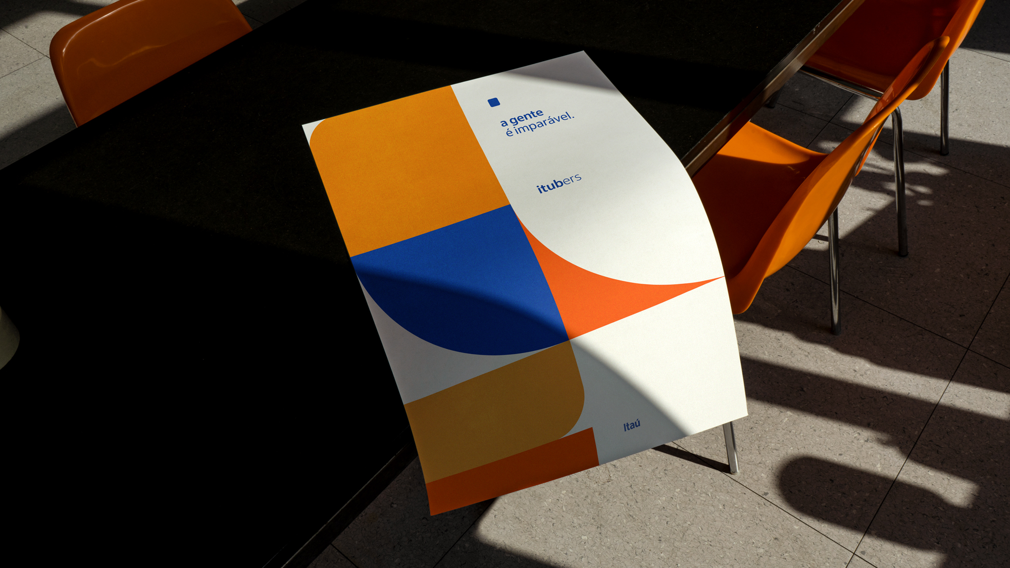
O projeto reinterpreta o clássico logo do Itaú - desenvolvido em 1980 por Alexandre Wollner, e estrutura-se na mesma solução gráfica: o rigor estrutural do grid e a flexibilidade de composição que se utiliza de formas geométricas e modulares.
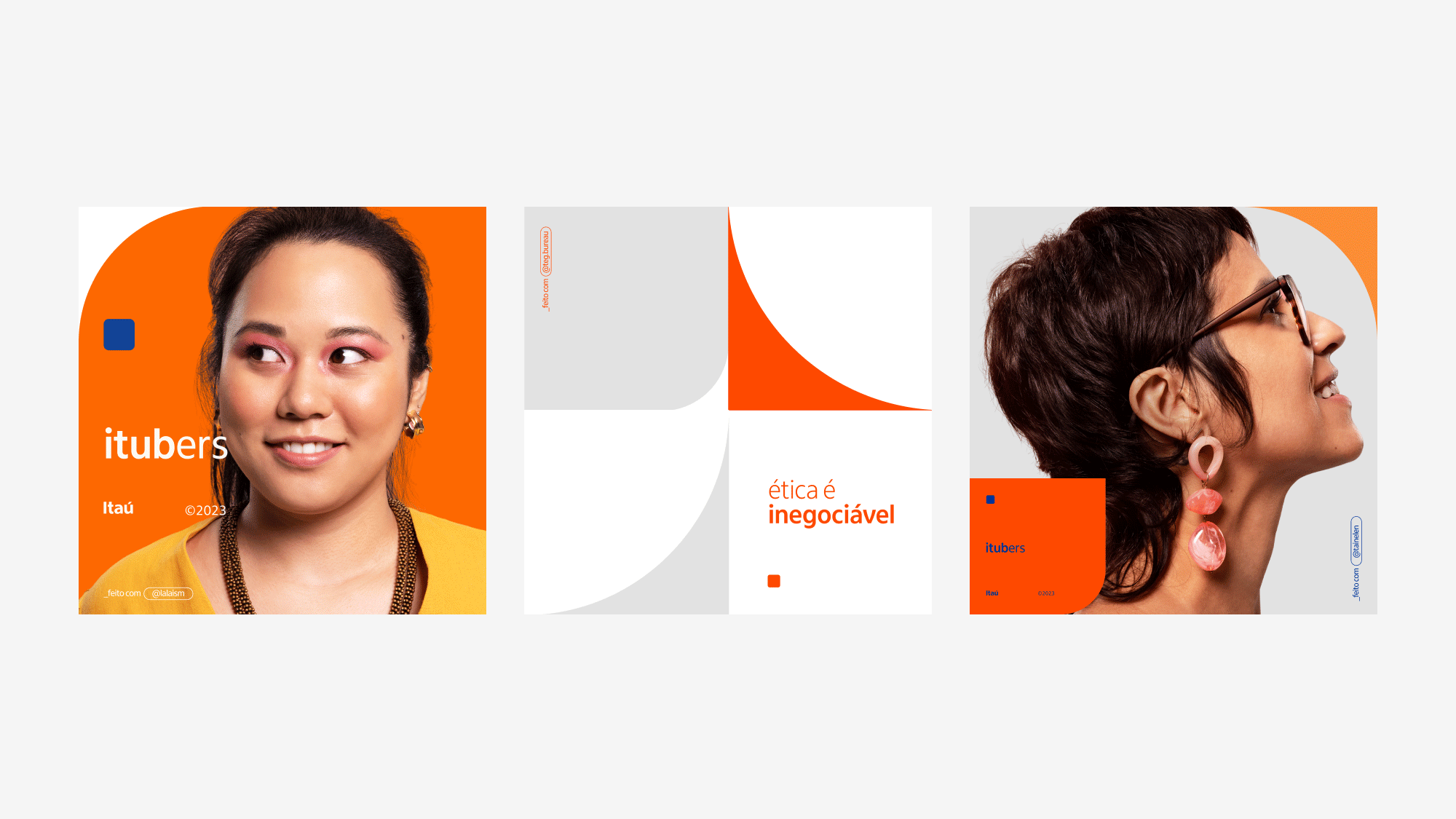
Subdivide-se o logo em seus dois eixos de simetria, gerando quatro unidades independentes. Os módulos – representando as partes do todo – são passíveis de deslocamentos, subdivisões e variações de escala e cor. Sua recombinação cria encaixes improváveis em arranjos abstratos e cartesianos. O gesto gráfico reitera a fortaleza da própria cultura interna do banco, que se apoia na individualidade de cada unidade, na potência existente nas interconexões das partes e na força de um todo consolidado.
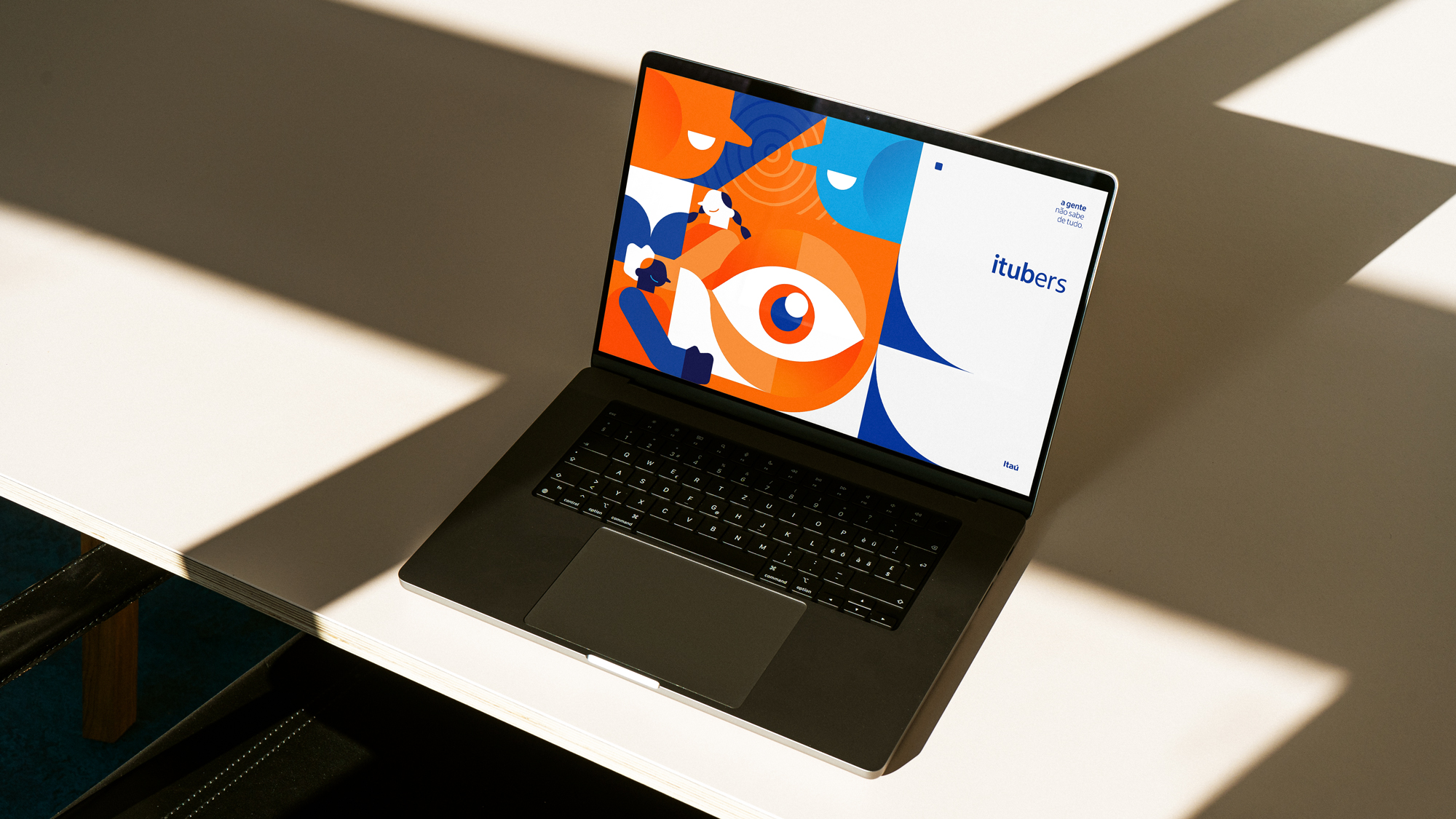
As ilustrações, assinadas por Luiz Mello, seguem a estrutura geometrizada da marca, se encaixando em um grid de 9 células. A figura humana é o elemento central das composições, demonstrando os valores de união, pertencimento e diversidade.
Apesar da linguagem abstrata ao caracterizar os personagens, o estilo de ilustração ainda abre margem para toques de pessoalidade, demonstrando a diversidade proposta pela empresa.
Assim como os demais elementos gráficos desenvolvidos para o sistema visual, a geometrização das ilustrações foi pensada para possibilitar grande variação de escala e recortes, aplicada sempre de forma modular. Assim, as ilustrações se encaixam entre si e entre os demais elementos gráficos da marca - formando conjuntos que possibilitam narrativas e desdobramentos variados.
A imagem fotográfica, por Pedro Dimitrow, expressa o colaborador como o centro de atenção da marca, num shooting articulado com os próprios colaboradores da empresa, representando-os em sua faceta mais humana embora, ainda assim, profissional.
About
Itubers is the name given to the 87.000 collaborators of Itaú Bank. The project of Tég © Creative Intelligence Bureau, alongside with the Brazillian agency Galeria, was to present a new integrated identity that expresses the development of the company's internal culture. This project – modular, playful and flexible – contextualizes the values of the collaborator's new daily routine in an appealing and captivating way, stimulating their sense of belonging and recognition.
Through this work, we rearticulated the company's graphic system – one of the most memorable of Brazil – integrating typography, icons, colors, graphics to images, illustrations and compositions under the same gestalt, expressing and redesigning the pillars of Itaú's internal culture.
The project reinterprets the classic Itaú logo – designed by Alexandre Wollner in 1980, restructuring itself through the same rationale: the grid's strictness and the composition's flexibility that uses modular geometric shapes.
We subdivided the logo in its two axes of simmetry, generating four quadrants that can be rotated and subdivided, sometimes creating unlikely and abstract shapes, sometimes creating meticulous and rigid compositions. This graphic gesture reinforces the internal culture of the company, which is suported by each employee's individuality and their powerful connections – between employes and between employee and Itaú. The parts in this diversity constitute a strong and consolidated whole.
The illustrations, made by Luiz Mello, follow the geometric structures of the brand, fitting into a 9 modules grid. The human figure is the main element of the compositions, showing union, belonging and diversity.
Despite their stylistic abstract look, these playful and expressive illustrations still allow room for personality touches – showing the view of the company on diversity.
Like the rest of the graphic elements developed for this visual system, these geometric illustrations were designed to behave with a wide range of scale and cutouts, and then applied in a modular system. Thus allowing the illustrations to be combined between themselves and other visual components, creating an extensive variety of narratives and applications.
The photographic image, by Pedro Dimitrow, expresses the employee as the brand's center of attention, in a shooting articulated with the company's own employees, representing them in their most human facet, although still professional.
Ficha Técnica
Executive direction
Stephanie Noelle
Creative direction
Guilherme Collado Garofalo
Phil Daijó (Galeria)
Design & Art Direction
Laís Matias
Pedro Mooniz
Thayná Britto
Adriano Santos
Gabriella Serrano
Project Management
Juliana Paiva
Ana Júlia Rabelo
Stephanie Noelle
Creative direction
Guilherme Collado Garofalo
Phil Daijó (Galeria)
Design & Art Direction
Laís Matias
Pedro Mooniz
Thayná Britto
Adriano Santos
Gabriella Serrano
Project Management
Juliana Paiva
Ana Júlia Rabelo
Illustration
Luiz Mello
Photography
Pedro Dimitrow
Motion Design
Lívia Aprá
Fabio Del Rio
3D Rendering
Felipe Zentil
Typography
Dalton Maag
Luiz Mello
Photography
Pedro Dimitrow
Motion Design
Lívia Aprá
Fabio Del Rio
3D Rendering
Felipe Zentil
Typography
Dalton Maag
Agency-partner
Galeria
Phil Daijó
Itaú
Renato Haramura
Fernanda Meirelles Ethel
Raquel Martins Melo Miranda
Galeria
Phil Daijó
Itaú
Renato Haramura
Fernanda Meirelles Ethel
Raquel Martins Melo Miranda